Monday, January 26, 2015

Call It Something or Call It Nothing: Maika Carter's Progress

Maika Carter, from Call It Something or Call It Nothing.
View of gallery wall in Maika Carter's Call
It Something or Call It Nothing
In the small Project Room in the Gallery at Columbus College of Art and Design, recent graduate Maika Carter is having her first solo show, Call It Something or Call It Nothing, up through February 20. I haven't seen a lot of publicity for it, but I'm delighted to recognize this work of questioning beauty and maturity.


The show is arranged like eight
chapters of a photographic narrative. Its progression from subject to subject is clearly delineated; the content of each unit is presented in distinct, striking images, and the movement from section to section feels organic. Best of all, the last chapter constitutes a synthesis up of all that has come before. What has it added up to? Something essential and true packed into the the mundane and happenstance? Or an affirmation of meaning in life's trivial accumulation? 
Maika Carter, from Call It Something or Call It Nothing.


The first photographic grouping—of images large and small, matted and pinned in well-considered groupings to the wall—features shoes, mostly empty. The black and white photograph of ballet flats facing one another across a break in the asphalt has the punch of confident simplicity. We've begun a march or a tour, but there's a question of direction and purpose from the first step. How will we fill the shoes, what is the purpose, where will we go? Carter's photographs, black and white mixed with others of saturated, strong color, don't suggest to me ambiguity so much as they suggest the very human condition of eagerness and determination even in want of a map. The images are all bold. Does the confusion of direction among the shoes indicate folly or indecision? Or simply the fact that life offers little direction?

Maika Carter, from Call It Something or Call It Nothing.
We walk to chapter 2 only to find us in the place of the Missing, where things have vanished or are fading from our sight. This is a grouping of photos that arrest you not with a pounding message, but with an ache of sorrow that accumulates as you have to move up close to the many small images gathered around the larger ones. Many of the photographs on these walls are no larger than 3 inches square. When Carter blurs the content, it increases the intimacy between viewer and picture, leading to heightened emotional impact. The picture of the yellow warning tape leading across the unadorned pavement square causes by suggestion more sorrow than would a lurid, graph crime scene shot.
Maika Carter, from Call It Something or Call It Nothing. Group
photo including the artist.


Maika Carter, from Call It Something or Call It
Nothing.


But the next section of  colorful photographs moves us in the way we respond to the scrapbook of a big, happy family. Carter brings us to a large, rambling spread of smiling relatives and friends of several generations—people happy to be together, happy to do what they are doing, feeling special and loved. I feel certain that this passage of the exhibition will leave no viewer unmoved. Carter's casual arrangement works beautifully here, where we feel the high spirits and warmth including us too. I think that it's partially the scale of the pictures and the fact that we have to approach them closely—as if we were indeed perusing a scrapbook—that makes it feel so inclusive. I reacted to these not as to pictures of strangers, but as to people whose happiness I shared. I felt no barrier. The viewer is one of the company, and happy to be be there as a familiar of these people.


Maika Carter, from Call It Something or Call It Nothing.
Collection of friendship photographs.

Are we reading an autobiography or are we a character in the artist's? Are we following a tale of Everyman? The question cannot help but come to mind at many points, but especially as the narrative descends from confident, social well-being to a chapter of literal effacement—a Slough of Despond if you will. 


Maika Carter, from Call It Something or Call It Nothing
Carter gives us many alluring images of humans, but with their faces or head blurred out or cropped from the frame. The smiles, the friendly connections are gone in a new milieu of isolation and anonymity.
Maika Carter, from Call It Something
or Call It Nothing.

The narrative continues through several more chapters that alternate roughly between presence and absence, between happily socialized security and images of vacant, drifting society. 

A chapter focused on the photographer herself is particularly arresting. It would be poignant were the pictures not so bold and frank. As usual, many pictures—large and small—are assembled, but the viewer has to think twice to grasp that the subject is the artist, so they must have been staged. Every one of them has the air of complete spontaneity: funny faces, dramatic poses, but of artistic quality far beyond the photo booth. They are so natural, in fact, that they raise doubts about everything that has come before. Maybe the show really has been the work of an anonymous third party.
Maika Carter, from Call It Something or Call It Nothing.

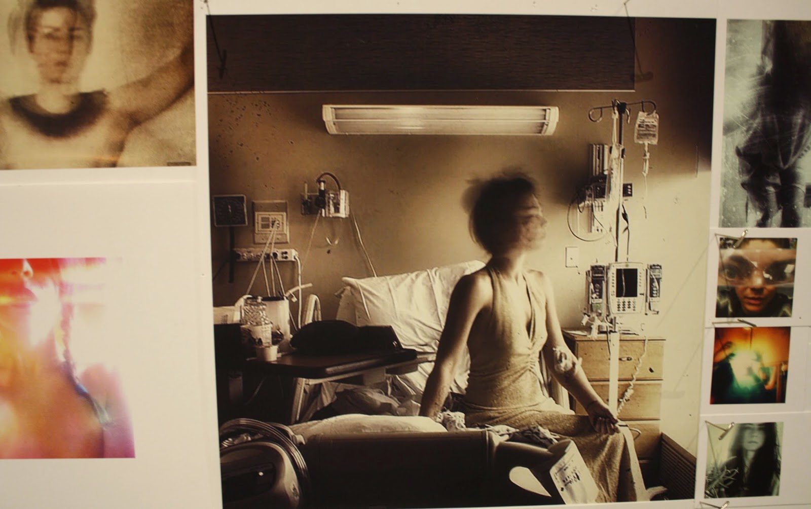
The cluster of self-portraits focus on large, matter of fact images in full color and in sepia, of the artist in the hospital, recovering from abdominal surgery. The brilliantly-well lit hospital room with the bloody tubing emanating from her belly is unnerving except that she faces the camera as if she were in conversation with you, the friend close enough to be visiting. Throughout the show, you have been reeled into her world and point of view and now, here you are, paying a post-op visit, the kind you wouldn't be able to stomach with any but your very best friend.


Maika Carter, from Call It Something or
Call It Nothing.
Maika Carter, from Call It Something or
Call It Nothing.
By the time I arrived at the last section of the show, everything that came before had prepared the way for a rich consideration of the title proposition, Call It Something or Call it Nothing. The photographs in this area switch back and forth until their messages of anxiety and hope at last intuitively merge. The artist wonders, given where she's been and what she's experienced so far, what life is? Something or nothing? Love or anomie? Do we invest in the future? Or do we lie down and see what hits?

Maika Carter, from Call It Something or Call It Nothing.
The landscape Carter has chosen for this final reverie is far from dreamy, bucolic, or reassuring. The images are urban, spray-painted, tattooed, and seem remote from the reassuring sense of middle-class order and safety many of us associate with a life and with a future meaning "something."

I'm not sure that Carter is acquainted with John Bunyon's The Pilgrim's Progress, but in this show I feel a connection with that tale of moral trial and resilience. The artist takes us through eight passages of pleasure, doubt, and grief. Without denying beauty, she doesn't stop to lament when it's absent. A calm, even-handed air of acceptance runs throughout the show, whether we witness happy camaraderie or pictures of lost of identity.

I think Maika Carter's first solo show is a knock-out. She shows her powers as a photographer, as a story-teller with an excellent editorial sense, and as an individual with the wisdom and intuition that make her skills important. I, for one, will be following with great interest an artist who shows such maturity straight out of the box.

Maika Carter, from Call It Something or Call It Nothing.

Monday, January 19, 2015

The Poetry of Pia Fries

I have the Pizzuti Collection to thank for introducing me to the work of Swiss painter Pia Fries. Though widely shown and awarded in Europe, her work is in only three public collections in the US: the Los Angeles County Museum of Art, The Detroit Institute of Art, and the Albright-Knox Museum in Buffalo. The Pizzuti's like her: The subject of this post isn't her only work in their collection. Perhaps we will see even more. I will hope. 
Pia Fries, one of five panels, Les Aquarelles de Leningrad,
2003, oil paint and facsimile on panel, 31-1/2 x 23-5/8."
(Print subject: Red geraniums and butterflies)

One of the most delectable moments of the current Now-ism show is Fries' five-panel work of paint and collage on wood, "Les Aquarelles de Leningrad," "The Leningrad Watercolors."

Each panel of blonde wood, planed to serene smoothness, has attached to it a print torn in half. (These are plates from an early 19th century book of botanical watercolors.) The halves are positioned in different ways vis-a-vis each other from painting to painting. Their placement sets the stage for extravagant, luscious streams, snakes, ridges and ribbons of oil paint, laid down with the élan of a pastry chef—Fries is sure to have used some of the same techniques and similar tools. 

The painting shown to the right includes all the elements that Fries combines in each of the panels: the torn botanical print and mounded  paint (not spread), raising the surface high above the board. There are soft, translucent designs directly on the wood that are made by oil paint so thinned that it appears like a stilled flow, as if it were marbled paper, or prepared microscope slides of simple wetlands plant life.

Pia Fries, one of five panels, Les Aquarelles de Leningrad,
2003, oil paint and facsimile on panel, 31-1/2 x 23-5/8."
(Print subject: caterpillar and moths on flowering plant)
Fries responds to the content and palette of the print with paint. But she does not engage in imitation of nature as we expect painters to do from a very long tradition of representation in various degrees of exactitude. Fries uses paint as construction material abstractly—suggestively—to imitate the shapes of the botanical and zoological life depicted on the collaged prints.  

I find it delicious that in the two paintings shown, the expression can strike us as both very abstract and strikingly literal. Above at the right, a stem breaks the print and muscles its way up to end in a crimson flower that pushes beyond the frame. The vitality is enormous, and it is buoyant too, thanks to the vernal green and brilliant yellow that shake off the shades from which the blossom emerges.

So too with the painting to the left, Fries uses her paint to imitate the subject of the print, which shows a caterpillar and moths. She creates her own, the worm ascending just as the one in the collaged picture does.
Pia Fries, detail from Les Aquarelles de
Leningrad


Pia Fries, detail from Les Aquarelles de Leningrad
From an angle, one can appreciate just how "real"—how substantial, how present, almost living—are the forms that Fries posits with paint. These aren't the result of trial and error, but of serene certainty: of a divine improvisation, it's so fearless. Her creation of reality from masses of paint is also rich, as in wealthy, confident that there is and will always be a sufficiency. Again, there is a divine confidence, a creative urge that takes your breath away.

Pia Fries, Les Aquarelles de Leningrad, 2003, oil paint and facsimile on panel, five panels, each 31-1/2 x 23-5/8."
These paintings, magnificent in their combined delicacy and assurance, attract the viewer to themselves by their rapturous rhythm of design and color. From across the gallery, they dance with an abandon of gesture that makes an irresistible invitation. Long before the eye can discern their botanical, sylvan, springtime subjects, the body knows them. They are a dance of sophisticated and elaborately choreographed gestures, costumed with flowing, dramatic garments. 
Pia Fries, detail from Les Aquarelles de
Leningrad

Fries' suite of paintings is so beautiful and so sensual that one can be completely satisfied simply with her bravura mastery of her materials. The power and freedom of her composition and her raw creativity are sources of infinite delight.

But beyond even the powerful appeal to body and eye, Fries' work packs an enormous punch to the understanding of what painting is; of what we mean by artistic representation; and of how we denominate the real and the represented—what's art and what's nature.

In Les Aquarelles de Leningrad, Fries seems to start with the proposition that the printed plates are already two removes from their natural subjects. They aren't watercolors at all: Any freshness of plant or insect—any connection to life that the original paintings may have had is gone by the time they have been translated into prints. The colors and unpredictability of the subjects are long gone. What relationship do these detailed, "accurate" representations of nature bear to their distant, living originals?

Pia Fries, one of five panels, Les Aquarelles de Leningrad,
2003, oil paint and facsimile on panel, 31-1/2 x 23-5/8."
(Print subject: caterpillar and moths on flowering plant)
In the space—"on the ground"—between the halved print, Fries goes not on a mission to find a better way to represent those flower- or butterfly- subjects. Representation is, of course, what we expect painters to do with their wonderful medium. Even abstract expressionist painters represent something, even if it is not tangible. Through the medium of paint, artists translate the real into Art.

Fries, though, uses her brave applications of paint to attempt creation of Reality from art "originals." Starting with the prints that are twice-removed from nature, she takes an approach that is in truth divine. She models organisms that have dimension, movement, and vigor pulsing through them. Her paint creatures/creations are suffused with an uncanny life that does not "capture" growth, movement and natural color, but performs them.

Once created, though, there's no getting around the fact that her beautiful lives have become art. But are they are like the printed watercolors? You can't close the book on these. They are specimens for a natural history museum; they come as close as a human can come to making a living thing. 

Is this Dr. Frankenstein? Is this a cloning experiment? I don't think so. It is a phenomenal exploration, though, of raw creativity; a fearless trip to the intersection of "real" and "artistic" or, as many like to say, "false." Fries is close to breaking the sound barrier in her headily original work. How magnificent I find the idea of breaking through two levels of flat representation to make life from oil paint; to evade traditional representation with an aggressive ideal of creativity. 

I can't get enough of art at this level: beautiful, masterful with materials and technique, and wildly ambitious in thought.

Friday, January 16, 2015

At the Columbus Museum of Art, Artists Making Money.

In——We Trust: Art and Money is a broad and often amusing show at the Columbus Museum of Art, continuing through February. How does a curator focus a show anchored by two words with such culturally potent and complex meanings? Art? Money? Tyler McCann, Columbus's new associate curator for contemporary art, offers us a show of almost bewildering inclusiveness. Because only a few images from the show are available, I'll print them in this review to give the reader an idea of the variety of work displayed. I want to focus, though, on the theme I was most interested in, which is artists and how their practices relate to commerce.
Paul Ramírez Jonas, We Make Change, 2008 (detail).
 Penny press machine, oak, plexiglass, one penny from each year
 minted from 1909–2008. Photography: Paul Ramírez Jonas.

 Courtesy the artist and Koenig & Clinton, New York.

In the show's opening position is Andy Warhol's wonderful little painting of both sides of a two-dollar bill, lent by the Dayton  Art Institute. Warhol made it in response to the exhortation to paint what he liked. That would be money, wouldn't it? Warhol was a master draftsman, and there's a pencil drawing of $5 banknotes that communicates the controlled emotion one feels in master drawings of the nude. The wonderful thing about his money portraits  is that they are both careful in their representation and fresh in their expressiveness: His self-awareness is clear, but there's also an innocence too that asks to be taken seriously.

Why shouldn't the artist want to make money? Everyone else does. Are his skill and his creativity in opposition to a goal shared by every normal person in society? Must he only represent money? Who decides that he is above the rest of society?


Cildo Meireles, Zero-Dollar Bill, 1978/2013. Image courtesy the artist. 
Photo copyright Pat Kilgore.
Sarah Cain, in a charming selections from a work named "$ forty three," 2012, shows several individually framed dollar bills over which she has painted brilliantly colored geometrical designs that favor equilateral triangles. We come to understand the triangles as pyramids when close inspection demonstrates that on some of the bills she has not painted over the currency's pyramid topped by the glowing eye. Aside from the suggestion in her title, this is the only detail that reveals the fact that she has actually painted on legal tender. 

Cain paints so comprehensively that sometimes only the tiny glowing eye itself peeks through. It is then the merest speck in the field of color; it's easy to overlook entirely. 

On a one-dollar bill, the motto inscribed above the configuration of the pyramid and beaming eye is "Annuit Coeptis," roughly, "providence/god shines on our undertakings." We historically understand "our" to be the republic's. 

Cain removes the providential eye from its monetary setting and places it in a field of exotic color and design. As such, it becomes the reverse of an evil eye talisman. The eye of god shines out with a hopeful message: Prosperity for the artist? Increased creative potency? It seems that Cain re-values money and condenses its power to a capacity that inspires and bring good things to pass.
Superflex, Bankrupt Banks, 2008 – present, banners:
paint on fabric, 79 x 79 inches; panels: vinyl on painted MDF,
79 x 39.5 inches, Coppel Collection, photo courtesy Nils Staerk
 and Fundación Jumex Arte Contemporáneo.

On the theme of artists and money, I found the most poignant and amusing works to be two from Caleb Larsen. Fortunately both of these are pictured with captions on his website, linked above. Do look them up.

"$10,000 Sculpture in Progress" a modest piece from 2009, is a dollar-bill acceptor set into the wall. It's just like the one on a Coca-Cola dispenser or candy machine, covered with a sticker noting that it accepts "$1 & $5." The direction to Insert bill Here is illustrated with a hand holding a dollar bill in the proper position. The gallery note provided by Larsen suggests that when $10,000 is collected, then he will produce the work. What could be clearer about the connection between art and money? 

Meschac GABA, Bankivi: Housing Bank, 2014,
 Wood, decommissioned Central African (CFA)
franc banknotes, plexiglas, assorted coins 
 
The acceptor works, by the way. I made a donation, which it sucked right up. Being myself the recipient of largesse, I'll donate to any artist who asks. For all I know, he's on this third project by now. More power to him. But I feel confident that many react to this as to a scam: "If he's got work in the museum, he's not hurting!" Oh, if only. This work is another way of measuring public perceptions of how art is financed. It measures our illusions, assumptions, and prejudices about who artists are—tricksters? malingerers? I would love to see a follow up to this piece. Did museum goers react to it as to a piece of rhetoric? Or as a statement from a working artist?

Next to "$10,000 Sculpture in Progess" hangs a framed document, letter-press printed on fine paper, also by Larson, titled "The financial footprint of the artistic practice," 2009. This is its text: "On this date the undersigned Collector agrees to transfer the total credit card debt the artist Caleb Larsen has incurred as a result of maintaining his artistic practice.//The balance of $—————will be transferred from the artist's credit card account to that of the Collector." Lines for the signatures of Collector and Artist and the date follow.

Funny? Yes. Incisive? Yes again. Can the Collector be a patron? Can people invest in the artist's freedom to create, or only in the commodity of the artwork? Who appreciates the artist as a worker who must not only have food on the table, but space and the time for ideas to develop over uncluttered time? 

Larson implicitly asks where we think the art works come from? And the answer is not only from materials and a studio, as the IRS would have it. It's from a secure and nurtured person, a thinker and a worker secure in the value not only of great works, but of the experiments, essays, and time, time, time it takes to midwife them. One big question lingers in this work, though. It's not only framed, but under glass. No one can take the document and sign it, as one can contribute through the machine. Does Larsen have low expectations? He's already found his patron? Maybe Collectors want to think it over and have their attorneys add a few clauses?


 William E. Jones, Color Coordinated Currency (Green), 2012. Image courtesy of the artist and David Kordansky Gallery, Los Angeles, CA. Photo Brian Forrest.