Monday, September 30, 2013

"Blues for Smoke" at the Wexner Center for the Arts

s
Roy DeCarava, Dancers, New York, 1956
Gelatin silver print, 14 x 11." Courtesy of the DeCarava
Archives.
Jaki Byard, Blues for Smoke, 1960,
album jacket.
I have written about travel before, but never in the guise of an art review. Blues for Smoke, out of the Los Angeles Museum of Contemporary Art, seems more like a city than an exhibition. The only elements it lacks are architecture and food. It has painting, photography, sculpture and installation. It has full-length movies, videos, documentaries, concert films, and sixty hours of The Shield. You can lean against the wall to hear whole albums of music by jazz and blues musicians (no seating, unfortunately, provided for 35 minutes of the namesake album, pianist Jaki Byard's 1960 Blues for Smoke). 

Blues for Smoke fills every inch of the Wexner Center. Headsets for music dangle ready for use in spaces better left as the passages they normally are; only the restrooms remain artlessly functional.

The outsized show reflects the excellent impulse of curator Bennett Simpson, assisted by artist Glenn Ligon, to provide as many lenses as possible on the cultural notion of the blues. And what would that notion—"the blues"—be? Refreshingly, no statement is made, no definition suggested. Only works of art are offered to us. What do we think? In or out? Do we think, "Spot on!" or "What's that doing here?" 


Beauford Delaney,Portrait of Charlie Parker, 1968.
 Oil on canvas, 28 3/4 x 23 1/2 in. 
Courtesy of Michael Rosenfeld Gallery, New York 
Still, Simpson clearly starts from the premise that the blues are a form of musical expression shaped by the impulse to make something out of the nothing of hardship. The blues has inspired nearly every art form and continues to color and shape American—and possibly foreign—culture(s).

But fundamentally, it's music, with which the show is loaded. There is less Leadbelly than Jaki Byard; less Big Mama Thornton than John Coltrane. In general, Simpson isn't as interested in the roots as in the shoots—in all the ways the blues inspire.

Blues for Smoke is heavy on jazz. Beauford Delaney portrayed Parker ("Bird") in 1968, thirteen years after the saxophonist's death at age thirty-five. Parker is not presented realistically, but through symbols. His skin is so black that it is like a rainbow; his costume is like an African prince's golden raiment. He doesn't hold an alto saxophone, but a hand-mirror decorated with musical notes: His reflection must be music itself—or the Bird that sits near his shoulder? Is the sparrow from a Kansas City sidewalk transformed into but a regal West African crow, gliding above Sahara sands?


Art Ensemble of Chicago, Record jacket for Art Ensemble of
Chicago with Fontella Bass,
1970, America Records.

(Image not in Blues for Smoke)
Beauford Delaney was active during the Harlem Renaissance but moved during the '50s to live in France. A gallery note tells that he did not in fact consider himself an expatriate, reasoning that one can only expatriate from a country that claims you in the first place. "One must belong before one may not belong. I belong here in Paris, I am able to realize myself here. I am no expatriate."

Without exploring anew the details of music imported with West African slaves and its shaping of the blues, Simpson gives significant attention to the free and improvised jazz of the 1960s and later made by musicians like the racially and historically conscious Art Ensemble of Chicago. The record jacket from a 1970 release (not included in the show) only hints at their connection to Africa, made in their performances not only through instrumentation—talking drums, floor drums, rattles, whistles and other percussion equipment; use of  Western instruments to produce non-Western sounds—but through exotic costume and staging. The group's motto was, "Great Black Music, Ancient to the Future."

The hour-long film, Art Ensemble of Chicago in Concert,1981 (Rhapsody Films, 2005) is one of the first events you'll encounter at Blues for Smoke. Placed as it is, this electrifying film makes it hard even to proceed any farther. AEC's sweating musicians play from electrifying, almost ecstatic inspiration. Lester Bowie, the trumpeter, dresses in a white lab coat, emphasizing the experimental nature of his work, but the others—I reveal what no note does: Malachi Favors, Joseph Jarman, Roscoe Mitchell, and Famoudou Don Moye—wear masks or face paint and garments in several African styles, adorned with cowrie shells and other jewelry. The color and richness of the pageantry provide an unforgettable display of racial dignity and pride. In their avant garde music it's difficult not to hear the links they make between improvisational jazz ("American classical music") and sources in African rhythms and sounds.

A fascinating documentary about powerhouse, avant-garde pianist Cecil Taylor demonstrates his daily aesthetic and cultural ties to Africa (Cecil Taylor: All the Notes, 2006. 72 minutes, Dir. Fred Barney Taylor; Maestro Media, 2009). Because the background of his life is so impregnated with Africana, one can't help but wonder about associations he may make between his racial and cultural background and his extraordinarily grounded approach to music-making. He works in a way that almost entirely eschews Western, academic notions of how music is put together, down even to the basics of scales, preferring to be led only by the ear and confidence in instinct. 


Arkestra, Barcelona, September 21, 2013. Photo, Suso Navarrete
(Image not in Blues for Smoke)
And another great avant garde musician from the '60s and '70s is Sun Ra, whose connection to an Egyptian-based mystical morality binds the music of his Arkestra to social betterment for Black youth. Blues for Smoke includes Ra's 1972 film, Space is the Place, (GRP AAIMPD249, 1993) with the plot of a conventional grade B urban action movie. White law enforcement officers try to keep Ra and the Arkestra (all in defining, exotic costume) from performing, and slick Black pimps exploit innocent Black girls. Thanks to powers that make Ra basically superhuman—harmonic progressions converted to energy—he saves all situations.

The blues? Are we still talking about the blues with all these costumed improvisers making appeals to different regions or fantasies of Africa? I was interested that Simpson insists on making them prominent, for it's not something that jumps out like the connection between the John Coltrane, Miles Davis, Thelonius Monk and the blues. The confident commitment of free improvisation, and the musicians' deeply felt relationship with a distant world—both are drenched in fundamental tensions. They yearn for a place and time long lost, yet they work to create a comparable world of dignity and beauty by framing their own rules; by replacing old assumptions with new. Among these avant garde Black musicians, the blues aren't only about the fatigue of suffering: From the downtrodden arises a Phoenix-like impulse to brilliance.  
David Hammons, Chasing the Blue Train, 1989. Mixed media, dimensions variable.
Collection S.M.A.K., Ghent, Belgium. Photo by Dirk Pauwels. 
 

A few works of visual art respond directly to music itself, not to musical figures. Roy DeCarava's black and white photos of dancers at a rent dance in a small kitchen (not shown) and, above, in a dance hall, beautifully reflect the deep mysterious movement of music on soul and body. In the kitchen-dancers' everyday dress, the sadness of eking out dream-space under the overhead light and next to the sink are tenderly acknowledged. In Dancers, the darkness that accompanies all freedom is surely the flip side of the blues.

David Hammons' installation, Chasing the Blue Train, is both funny, visually engaging, and beautiful in its arrangement of a select few, spare elements. Blue Train is the title of John Coltrane's ("Trane's") first album as a leader, recorded in 1957, so the title is a pun, as is the work itself, with a blue-painted HO-guage train chugging along beneath a tunnel of coal ("coal-train") on each loop. Among the landscape of piano lids the train traverses are boom boxes playing music of pianist Thelonius Monk, Coltrane's inspirational colleague, and of a trumpeter—probably Lee Morgan, who was on the Blue Train album (no gallery note reveals the personnel or music). 

The importance of Chasing the Blue Train for us is not so much in knowing details of the Coltrane-Monk association, as it is in Hammon's 1989 response to the legendary album. Hammons'  installation is minimal, cool, and amusing. Its light-heartedness is appealing. It's based on word-play; the music is a prop for the visual and the implied verbal. I think it's more a commentary on the culture built around jazz than about the music itself. Hammon reflects on the wish to be "on the train" of "With It," recognizing the scenery, knowing the station names, where to get on and off the cool-train.
Bob Thompson, Garden of Music, 1960. Oil on canvas, 79 1/2 x 143 in. Wadsworth Atheneum, Hartford, Connecticut
The Ella Gallup Sumner and Mary Catlin Sumner Collection. Courtesy of Michael Rosenfeld Gallery LLC, New York, NY. 
Bob Thompson's enormous painting, Garden of Music, celebrates great jazz innovators of his moment. Among the musicians in his Garden of Eden are free jazz saxophonist Ornette Coleman and musicians associated with him: trumpeter Don Cherry, Ed Blackwell literally on the drums, and Charlie Haden carrying the bass (line). To the extent that pattern, color, and visual rhythm can "make music," Thompson aims to do so. And what  truly excites me is that so immense  a canvas celebrates avant garde artists at the moment of their ascendence, when the future can still take their legacy to greatness or obscurity. It's not the same as making a portrait of Bird fifteen years after his death. Thompson is deeply in the middle of this scene. He was friends with Coleman and this musical circle in New York, though the painter and his wife expatriated to Spain. 


Melvin Edwards, Write When You Can, 1991.
 Welded steel, 13 x 10 1/2 x 8 in. Courtesy of 
the artist and Alexander Gray Associates 
Expats and Afro-centrists; people living where they never wanted to be, born into a world that didn't want them, or looking for a better place. So much of Blues for Smoke relates to location the will to move on and up—to the promise that a man who can choose his environment can change his lot. 

In general, I think that the two-dimensional works in this show are less interesting than the music, videos, and installations, and for this reason: The blues are a matter of movement, atmosphere, and ambiguous or unsettled states of being. These are best captured in transitory and dynamic art forms. Thompson's painting, and Delany's (above) pay tribute to blues figures, but there's a difference between demonstration or homage and being caught up an experience. Two-dimensional works throughout the show are secondary sources—representations—a step away from engagement. The blues are experience itself, involving time and space. 

Even a stationary, three-dimensional sculpture like this small relief work by Melvin Edwards fills space and time, psychologically and in terms time's expanse of possibilities. It implies past and future; its mood is as complex as the horror and strength of its form and materials. Write When You Can is a title packed with nuance, future, and possibilities. It signals departure, presumably from a dark place where this conglomerate of chain, gimlets, screws and fused steel will be left behind at "home." 

Does sorrow overwhelm us that this is where one has been, and that this will always be part some immigrant's life? What kind of congratulations do we give the person who leaves this? What will she say when she writes? How will she explain her new-found world to people fixed in the darkness of this one? Within the psychic space of Edwards' sculpture there is room for all these questions to exist and begin to play out in our imaginations.


Blues for Smoke includes 78 minutes of Richard Pryor Live in Concert, 1979 (directed by Jeff Margolis, HBO, 2006). If there were more than two headsets attached to the monitor, I suspect that Wexner could outright cancel the rest of the show. Blood runs through every laugh Pryor evokes. It's impossible to watch him without knowing that every joke you're doubling over about is a horrible truth. "Be happy," he says, "for any Nigger doing anything," and he probably cuts as close to the bone of the blues impulse as anyone can.


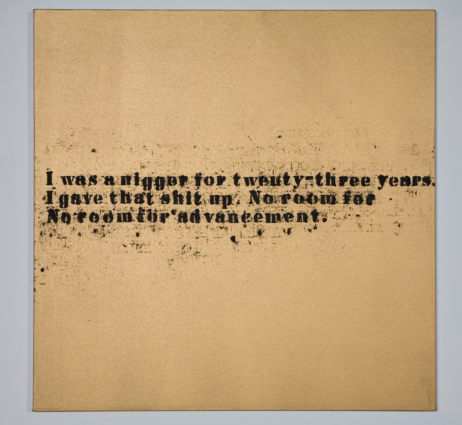
Glenn Ligon, No Room (Gold) #42, 2007. Oil and acrylic on canvas,
32 x 32 inches. Courtesy Regen Projects, Los Angeles.
© Glenn Ligon. Photo by Joshua White. 
Three canvases of Glenn Ligon's hang next to the monitor playing the Pryor video. Two have the text shown to the left: "I was a nigger for twenty-three years. I gave that shit up. No room for / No room for advancement." The other substitutes the word, "Negro" for "nigger." I was with a friend deeply-versed in Pryor, who assured me that this text is derived from Pryor', who is a great inspiration for Ligon too. 

These three paintings are from a much larger series with the same texts printed in greater or lesser degrees of clarity, surrounded by more or less smeared excess ink. It's a series painted of stuttering words that evenly divide a golden ground. Each canvas has, despite the sputtering and smears, an essential formal dignity. Yet despite the golden ground and the formal setting for the vernacular language, the canvas-to-canvas repetition never manages to get off the ground: There's no advancement. Nigger/Negro? How does one give that shit up? What's the relationship between statement and action? Between saying it on the stage, as comedy, and repeating it, in all seriousness, as text? Does anyone advance?

Such questions seem inevitably to lead either to constant expression of frustration and rage (Pryor, Ligon) or to movement (migration of the soul to real or imagined Africa, to Europe, to a hopefully less racist part of America). But movement away still leaves part behind. Zoe Leonard's  continuous installation/sculpture, 1961, is a poignant testimony to this idea of departure and personal history. Every suitcase added must represent more packed up from added experience—the difficulty of leaving the past behind, however painful it may have been. You can't shake the blues. You don't pack up in a pink suitcase and leave segregated America of 1961 behind as you click the latches.
Zoe Leonard, 1961, 2002- ongoing. Blue suitcases, dimensions variable.
Courtesy of the artist and Galerie Gisela Capitain, Cologne, Germany. Photo by Bill Jacobson. 
Leonard is a white woman in a show of mostly  Black artists. Simpson's piece suggests, however, just how far the influence of the blues penetrates through races, sexes, and nationalities. A splendid 14-minute, 2012 video by Wu Tsang, Mishima in Mexico, presents two young, English-speaking men of ambiguous sexuality who rent a hotel room in a Mexican city in order to finish a screen play of a book by Japanese novelist, Yuko Mishima. Moody, ambiguous, sliding between fiction and reality; character and role; and gender assignments, we watch it with questions from the surrounding blues environment. Japanese, Mexican, white, and transgendered: All these are categories that don't pop to mind with the term "the blues." Simpson invites us to see how far contemporary art can stretch the blues.


Stan Douglas, Hors-champs, 1992. Two-channel video installation with stereo 
sound 13:20 minutes. Courtesy of the artist and David Zwirner Gallery, New York.
Image courtesy of the artist and David Zwirner Gallery, New York, © Stan Douglas .
Blues for Smoke is a show of such grand scope, settled around so basic an issue—the  influence of the blues on contemporary artists and art forms—that it's impossible to come away unsatisfied. For any visitor there are beauties, surprises, brand-new satisfactions, and even old favorites to be found.

I was nevertheless very sorry to see that while Simpson gave much pride of place to music in a multi-media show, he did nothing to acknowledge musicians; he thought entirely like a visual arts curator, acknowledging only whom he assumed to be the Real Artists. 

One of the glories of Blues for Smoke is a 13-minute film, projected onto back-to-back screens. It records a performance of Spirits Rejoice by its composer, free-jazz saxophonist Albert Ayler and his ensemble. As the caption to the stills above reveal, all the credit goes to the film-maker, Stan Douglas. It requires very determined Internet searching on this work to eke out the name of any personnel on the performance beyond Ayler. Even though the trombonist is the great George Lewis (a MacArthur winner, even, in recent years), his name is never mentioned in the show or any materials connected to it. 

This is true of all the music films and videos. No names are given for the members of the Art Ensemble of Chicago, as eminent in music as any of the visual artists in this show. Ditto for the members of Sun Ra's colleagues, and the anonymous greats of music playing on the CD soundtrack for Hammon's Blue Train. Throughout the show, music is honored, but musicians—the most famous and groundbreaking—are anonymous. Or, in the case of the Stan Douglas film, what's celebrated is his film with his title, over the content of astounding music performed by genius musicians.

The confinement to visual (Art) standards in a multi-media show is curatorial oversight of a high order, suggesting that however prominently the music is showcased, it's all really just the blues. It's not embodied; it exists just in the air, an attitude, perhaps coming naturally to anonymous Black brethern, like all blues do. 

Can we advance a little here?

Monday, September 23, 2013

A Collection of Paperweights

Paul Stankard, 1982.  Lampwork spring beauty with rootball,
roots, and buds.  
On a recent visit to the Boston area, I caught up with an old friend who treated me to a whole afternoon's survey of his paperweight collection. Clarence (so I will call him here) has been buying paperweights since the early 1980s, when he and his wife chose them as a way to organize their trips to antique and flea markets: Here was something particular to look for. 

I can understand why. Paperweights are small, always beautiful, and there is magic in them. The glass worker's skill and the science of optics create exquisite miniature worlds far more brilliant, colorful, and breathtaking than our own. To handle a paperweight is to fulfill one's wishes for both whimsy and order, coexisting in an object that fits in your hand. We can take godlike satisfaction over the unity of a paperweight's system. Yet to experience a fine specimen's disciplined yet dreamy beauty is a profoundly human satisfaction: It's to receive a gratuitous gift of pleasure, however illusory.

In 1993, Clarence advanced swiftly from purchaser to collector once his curiosity led him to the very end of an estate auction held upon the death of an elderly, local eccentric; a person who had filled her house with collection upon collection of disparate objects. Although there were no paper weights among the lots, Clarence "could smell them. In that environment, they just had to be there." 
Half of a paper weight from
Perthshire, Scotland, ca. 1990.


His instinct proved so just that, once the family got to know him, he was invited back to the house many times. Each visit revealed more paperweights. His study in dealers' catalogues helped guide Clarence's purchases and establish fair prices. The long and short of the story is that, after having picked out 200 pieces on his own over the course of a couple years, ultimately, the family offered him the final 170 for a very low price. He accepted the offer. "That was when I began collecting," he says. Now, his knowledge and his collection are both vast, yet every piece he owns is special. Each paper weight has stories—its own history, and the story of Clarence's relationship to it.


1990s Perthshire paper weight, as above,
seen from a different angle
I was fascinated to see some half-paperweights, which Clarence has acquired from manufacturer's representatives who visit the few high-end stores that retail such luxury wares. My photographs show that the design itself is indeed a flat collection of miniature elements, carefully placed on prepared ground, assembled within a round form that holds them in place. The crystal is poured over it, the whole is heated and shaped as it cools. 

The sample shown in these two pictures is a millefiori paper weight: Its design has been composed of sections cut from thin glass canes, each of which is composed from several layers of colored glass. Millefiori means "a thousand flowers," which illusion is created by encasing layer upon layer of colored glass, then stretching them until they are very thin; cooling and cutting them into small sections—like cookies from a roll. This excellent video posted on YouTube by the Discovery and Science Channel illustrates and explains the entire process. 


Clichy, spaced millefiore, 1845-1860.
Clarence's collection ranges across the remarkable variety of paper weights. I was surprised to find that there are paper weights even in the folk art manner, which commemorate weddings and anniversaries with rough designs, or exhibit frit (ground-glass) slogans like "God bless our school," "Rock of Ages," or "Home Sweet Home." 

The focus of this collection is millefiori, though, and once I started looking with Clarence, I found myself exploring a wonderland of variations on a theme.

Where I've come to associate the finest glass with Venice, the most prized paperweights come from three French manufacturers, Clichy, St. Louis, and Baccarat, and from American glass works in New England. To the left is an antique Clichy, Clichy being prized for the vividness of its colors. A scan of the large collection time and again proved this to be true. Anyone with a choice would pick this out of a group for its robust color. Its design is one of many standards. The "spaced millefiori" means that each flower is placed without touching its neighbors.


Baccarat close-pack millefiore, 1849.
In contrast to the spaced presentation is the "close pack" millefiori, such as the Baccarat paper weight to the right. This has so many flowers, so small, and any spaces between them are filled with elements almost incomprehensibly small. Remember that the rounded crystal magnifies the size of the millefiori actually placed on the base. Remember, too, that each of the components of the tiny, colorful flowers is a glass filament, fused to its neighbors. So each millefiore is a rare work of glass art in itself. A paperweight like this is filled not only with beauty, but with hours and hours of the most delicate and painstaking work, some of which produced flawed products that never saw the light of day.

In that Baccarat close-pack, toward the right is a white cane with a black rooster formed inside it; at the top, rolling toward the back, similar form can be seen. These tiny animals are the mark of Baccarat paperweights, as are the years of manufacture, also memorialized on minute canes—in a long cane just below the center, with alternating red and blue marks.


Baccarat spaced millefiore on lace (upset muslin), 1848.
This Baccarat spaced millefiori (left) shows the characteristics clearly. These animal figure canes first appeared in 1846. They were produced after Baccarat's general manager, Jean-Baptiste Toussaint, found his young nephew, Emil Gridel, cutting animal silhouettes from black paper to amuse himself. Toussaint was inspired to borrow the silhouettes and have molds made from them: Thus the "Gridel figures," the tiny animal forms that appear in "classic" Baccarat paperweights in 1846. The classic period for paperweight paperweights is generally considered 1845-1860 for French paperweights and slightly later for New England paperweights. 
Ysart family, made in Scotland,
mid-20th century

Millefiori are also arranged to form symmetrical designs of stars, garlands, and fancy combined elements of many sorts. The Ysart family is credited with the birth of Scottish paperweight making in the 1930s. Originally from Spain, Salvadore Ysart and his family moved first to France and then to Scotland in 1914 at the start of World War I. This weight from Scotland is surely from the hand of an Ysart. Clarence is sure he can tell which family member; but there is no signature, so there is no way of stating it with certainty. I admire its five point-star—surely more difficult and clever than an even number—and its feel of a fine piece of jewelry laid on a velvet cloth.

Lampwork paperweights encase flowers, environments, animals or objects formed from glass (lampwork) in crystal, like the Paul Stankard work that opens this article. A fine lampwork artist's creations will give such an air of reality as to trick the viewer into believing them real: "How did you get those flowers in there?" as if they were inserted into a bottle rather than having had red-hot glass poured over them.


Chris Buzzini, lampwork floral, 1993.
Chris Buzzini's lampwork arrangment of wildflowers is certainly uncannily realistic. If it hints to a novice like me that the flowers aren't real, it's because they are so uniformly fresh, so much more evenly in bloom than I've ever experienced with real plucked flowers. The colors are so saturated that the bouquet gives almost more satisfaction than it would in reality. This is one of the joys of the paperweight as art form: the appeal of a permanently magnified, purified, and clarified reality that we are just a crystal surface away from achieving.

Buzzini has been at work in this medium for years. On a video at his website, he discusses his art while producing one of his paperweights.

Another contemporary master of lampwork is Paul Stankard, whose 1982 spring beauty opened this article. Clarence has collected another, far more complex work by this artist, which shows his interest not in an eternally fresh nature, but in its decay as well. The paperweight has a domed and a flat side, but on each there is a scene, each with equal and compelling visual interest. Not only is the lampwork phenomenal, but this work implies a narrative, which is very unusual among the works I saw.
Paul Stankard, environmental study, flowers and decay
on "sand," 1984. Top.
It's striking in the first place to have a carpet of "sand" to set a realistic stage for the plants. Usually, lampwork floats on a crystal sea; millefiori lie on black grounds or nestle among lace. A representational background is unusual and highlights the fact that the flowers are a little droopy. They even look like they need the support of the ground they lie on. 

But the big surprise comes on the flat side, on which there is usually nothing except a signature and/or a date, and not always either of those. It feels like we are in geological terms literally beneath the scene on top. Or, perhaps, we are a little way down the beach, in a tidal pool: It certainly feels like we are looking into shallow water.


Paul Stankard, environmental study, flowers and decay 
on "sand," 1984. Bottom.
The root ball and root that we saw in the spring beauty (top) are repeated here, but are taken in a mystical direction by forming the elements of a witchy mermaid whose fins and scales are replaced by willowy, waving roots. In her brown and green, wet setting, she is fascinating, both sexy and repellent at once. But she can only grow once her arms and legs take hold. Will she replace the morning glory whose days are numbered?Having looked at hundreds of paperweights with Clarence, I'm ultimately glad that I photographed only these few, under his generous guidance in his professional studio. Each piece is its own world of wonder and delight. Even after looking through a dozen, I knew enough to look deeper and deeper into them, and to see more in each one.

Clarence tells me that though there are many collections of paperweights in the United States, there are three major ones open to the public. One is the Rubeloff Collection at the Art Institute of Chicago. Also in the Midwest in the Bergstrom-Mahler Museum of Glass in Neenah, Wisconsin. Finally, the Corning Museum of Glass, in Corning, New York has a distinguished collection, which was featured when I visited around twenty years ago.

In this blog I don't say much about connoisseurs and scholars. I don't write against connoisseurship as much as I write to reassure those who lack it that art is available to all of us. 

But my afternoon among the paperweights was an excellent reminder of the value and the satisfaction of expertise. For Clarence, his pleasure in sharing it was obvious. For me, I hope it was equally clear how great the pleasure was for me to have that chance to learn and to know.
___________________________________________________________________
With a thousand flowery thanks to Clarence for his patient help with details in the preparation of this article.

Wednesday, September 11, 2013

Grand Opening of the Pizzuti Collection


 "Coming from the point of view of a passionate collector, the Pizzuti Collection seeks to present art by underrepresented voices from around the globe with work that transcends, elevates the mind and expresses freedoms.

The Pizzuti Collection shares the belief of its founder that art is fundamental to the individual and the cultural health of a community. It feeds the spirit, challenges the mind and stimulates thought."

How much better can it get? This is the mission statement of The Pizzuti Collection, just opened on the 6th and 7th of September in Columbus. Ron and Ann Pizzuti have been collecting contemporary art for decades and have just launched a venue—a handsomely restored, three-story, neoclassical building—for rotating shows of their treasures.  
632 North Park Street, Columbus, Ohio: The Pizzuti Collection

The building, opposite lovely Goodale Park, situated among the Victorian dwellings of the chic Short North neighborhood, has a European air about it that places it in piquant contrast to Ohio's other architecture-driven venues for contemporary art. Neither Ohio State's Wexner Center for the Arts (Peter Eisenman, 1989), Cincinnati's Contemporary Arts Center (Zaha Hadid, 2003), and the Museum of Contemporary Art Cleveland (Farshid Moussavi, 2012) has a permanent collection, but each schedules exhibitions curated locally or elsewhere and traveling. The Pizzuti—with its traditional painted iron fence, fine pea stone sculpture garden, and symmetrical facade—offers us a unique invitation to get close to works over the long term. Through them, we will come to know the collector's thought and sensibilities: That in itself should reveal to the patient observer a good deal about contemporary art.

For the opening, the Collection's director and curator, Rebecca Ibel, has

Douglas Perez (b. 1972)Ladacar III, 2010     Oil on canvas
88 1/2 x 63 in.
 
Los Carpinteros
Kosmaj Toy, 2012     
wood, metal and LEGO® bricks
98 1/8 x 98 1/8 x 98 1/8 in.
organized Cuban Forever, a show of fifteen Cuban artists. Some have been working since the time of the Revolution (Tony Mendez, recently retired from Ohio State) and some are up-to-the-minute artists—
Raul Cordero and Alexandre Arrechea, both of whom spoke in an inaugural panel. Some immerse themselves in the timeless look of Havana (Michael Eastman) and others demonstrate interests that are entirely cosmopolitan or theoretical.

The Inaugural Show itself includes some of the Pizzutis' earliest and dearest acquisitions, even a few moved directly from their house. These include works by well-known masters Frank Stella, Louise Nevelson, Jean Dubuffet, John Chamberlain, and Richard Tuttle.
LEFT: Frank Stella (b. 1936), Targowica III, 1973.Felt and acrylic paint on Tri-Wall cardboard. 122 x 96 x 8 in.

CENTER: Richard Tuttle (b. 1941), New Mexico, New York, #3, 1998. Arylic on fir plywood, 26 1/4 x 20 1/2 in. 

RIGHT: Frank Stella (b. 1936), 
Norisring, 1982. M
ixed media on etched aluminum
But what do all these names mean if you don't know their work already? The Old Masters of contemporary art remain unknown or inexplicable to many. Of course, the Old Masters of the Dutch 17th century are just as mysterious to most, but, being representational, they puzzle and irk us less obviously. We don't feel the mixture of hostility and embarrassment that contemporary art induces in its apparent opacity.

It feeds the spirit, challenges the mind and stimulates thought. 

My opening day experience of the Pizzuti Collection was wholly satisfying. After about an hour—more than enough time spent inside any museum or gallery—I stepped back into the flow of life on Park Street feeling my body and brains in dizzy tumult. I was boiling with outrage, contempt, laughter, scorn, puzzlement, frustration. I had even conceived a crush or two. I was seeing red—and neon pink, and jungle camouflage. My head ached.

And I can't wait to go back! I'll take this collection as it invites us to take it: slowly, a piece or two at a time. Because contemporary art comes from so many directions, with so many premises, concepts, and styles, no one should be able to do a walk-through and leave feeling unexercised, mentally or emotionally. In passing I saw works I thought were simplistic or disposable; I saw others that I could lose myself in for an afternoon, and some that made me woozy with wonder. A few made no sense at all to me: I felt no connection of any sort. Next time, I'll feel compelled to take those on as a detective approaches a case, or as a fighter circles a crafty opponent in the ring. 


The biggest thing about my hour at the Pizzuti opening was coming out feeling such strong, conflicted, elevated, engaged emotions. I wanted to argue, to make someone to explain; to steam open elusive works until their mysteries arose, vaporously, above them.
Dave Cole (b. 1975), American Flag (Lead), 2012. Lead sheet and stainless steel cable, handsewn. 28 x 52 1/2 in.
Agitation of any nature is a fine outcome for a visit to an art museum. We too routinely expect a museum visit to parallel a visit to a garden where all is comely and beautifully arranged. We expect to leave unruffled and uplifted in a general way, untroubled by challenges to our world-views.

Contemporary art isn’t a poke in the eye. It’s not an insult. But it reflects how someone else in our world is dealing with an issue in and of the times we share. In most cases, we already recognize the artist’s topic and materials.

Through the time we spend with contemporary art we can pause to be citizens of the world, to involve ourselves momentarily in ideas, visions, and points of view we'd hasten by on the street. Will such encounters always make us happy in the moment? Not necessarily. But our passions and our eyes awaken in a structured place where our minds are sharpened. Does it make us happier in the aftermath, to be surprised with wonder and beauty of the unexpected? To be roughed up by the outre; to be electrified or amused by the unlikely? Absolutely.

Welcome to our city's new playground; to its new cloister; to its half-way house for philosophers and punks. Thank you to the Pizzutis for sharing their purchases with the city and the world; for knowing the real value of art which, wisely invested in the lives of all their lucky neighbors, creates and enriches a thinking community.

LEFT: Enrique Martínez Celaya (b. 1964), The Two Worlds, 2007. Oil and wax on canvas, 92 x 118 in.    

RIGHT: Douglas Perez (b. 1972), Ahorrativo, 2010. Oil on canvas, 94/ x 63 in. 

FOREGROUND: Yoan Capote (b. 1977), 
Open Mind, 2009. 
Cut aluminum, 36 1/4 x 49 5/8 x 49 5/8 in., 
_______________________________________________________________________________________________________

All photographs courtesy of The Pizzuti Collection.